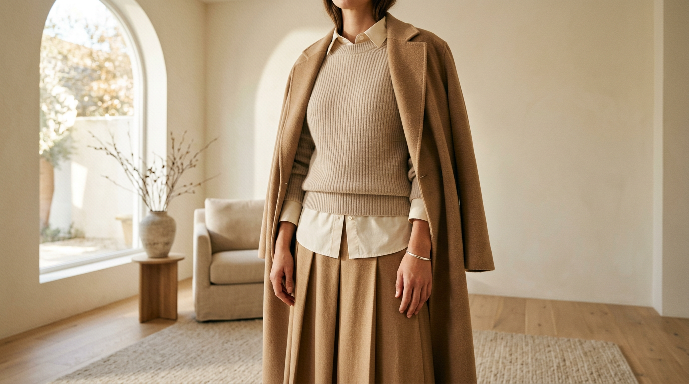
All-neutral outfits have a reputation problem. Cream, oat, stone, camel: people assume it’s the safe choice, then the mirror pic comes out flat and the fit check says nothing. The palette isn’t the issue. The surfaces are.
Interesting is the goal
Let’s retire “looks expensive” as the measure. Rich-looking is a finish line someone else drew. Interesting is better: the outfit makes someone look twice, ask where a piece is from, then notice the second thing.
When color steps back, the eye goes to other details. How a fabric catches light, how it drapes, how one layer sits against the next. That’s where an all-neutral lewk gets its personality.
Four finishes, four jobs
Ribbed knit gives you rhythm. The vertical lines add structure while the stretch keeps it soft, which makes it a good base layer or a fitted top under something looser.
Crisp poplin is the opposite: matte, smooth, and it holds its shape. A sharp collar or a sleeve that stands slightly away from the body gives knit something to push against.
Brushed wool is the soft-focus one. The fuzzy surface absorbs light and blurs edges, so a coat, scarf, or trouser in it adds warmth even in the palest shade.
Leather is the only finish here with real sheen. Even a little, like a belt, a boot, or the strap of a bag, gives the outfit a point of reflection. Soft, matte leather keeps it quiet. A slicker finish makes it a statement.
Matte, soft, fuzzy, glossy. Each one answers light differently, and that contrast does the work color usually does.
Tonal layering rules
Texture needs a little discipline or it turns into a pile. These are the rules worth keeping:
- Stay in one temperature. Warm neutrals (cream, oat, camel) go with warm. Cool neutrals (stone, greige, soft gray) go with cool. Mixed undertones read as an accident, not a choice.
- Shift the value a step or two. Aim for light, mid, and slightly deeper within the same family. Three near-identical shades blur together.
- Give every layer a different finish. Two matching surfaces side by side flatten each other. If the top is ribbed, make what goes over it smooth.
- Pair fitted with volume. Texture lands best when there’s shape underneath it. Something close to the body, something with room.
- Put the softest texture near your face. A brushed wool scarf or a ribbed collar frames you better than a stiff one.
- Squint test. Look at the outfit with your eyes half closed. If it collapses into one shape, swap a finish, not a color.
One accent, no more
Once the textures are working, you can add one accent. One. The moment there are two, the outfit stops being edited and starts being decorated.
Dusty pink works because it’s muted enough to behave like a neutral. Think a soft knit, a scarf, or a flat. Keep it warm-leaning so it sits with the cream and camel instead of fighting them.
Silver is even easier, because it’s a finish, not a color. A chain, a cuff, a buckle, or a ring catches light the way leather does, so it stays inside the palette while still adding a little shine.
Either way, keep the accent small, and put it where the eye already travels: near the face, at the wrist, or at the hem. If the accent is the biggest thing in the outfit, it’s no longer an accent.
A fit check to try
Start with an oat ribbed knit as the base. Layer an off-white poplin shirt over it, worn open so both surfaces show. Add camel brushed wool trousers, then a leather loafer in a deeper brown. Finish with a single silver cuff.
It’s one warm family with four finishes, a few steps of value, and one shiny detail. Nothing in it is loud, and it’s still the outfit people ask about.
The point
Neutral isn’t the quiet option. It’s the edited one, where every piece has to earn its spot because there’s no color to hide behind. Start with the surfaces, keep the temperature consistent, and let one small thing break the rule. The edit is everything.
Leave a Reply