Tag: the edit

  • Neutral Doesn’t Mean Boring: Building Depth With Texture

    Neutral Doesn’t Mean Boring: Building Depth With Texture

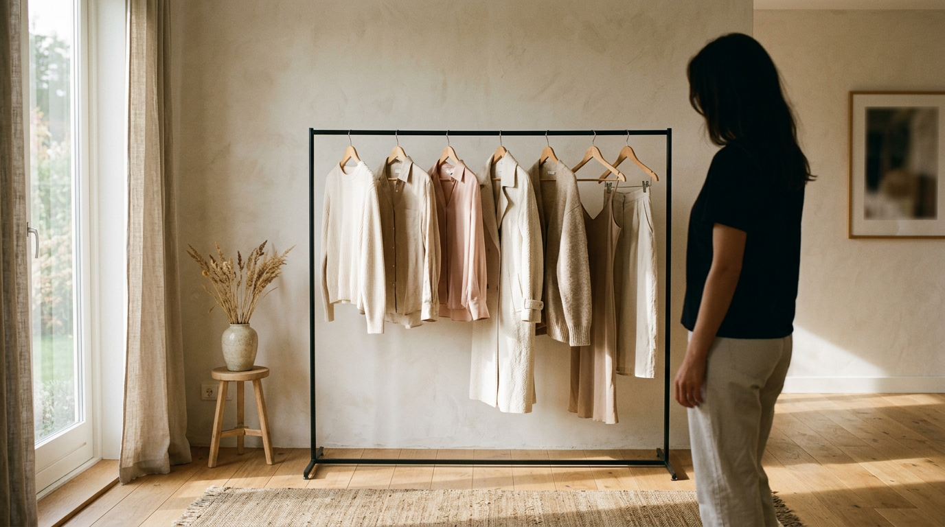
    All-neutral outfits have a reputation problem. Cream, oat, stone, camel: people assume it’s the safe choice, then the mirror pic comes out flat and the fit check says nothing. The palette isn’t the issue. The surfaces are.

    Interesting is the goal

    Let’s retire “looks expensive” as the measure. Rich-looking is a finish line someone else drew. Interesting is better: the outfit makes someone look twice, ask where a piece is from, then notice the second thing.

    When color steps back, the eye goes to other details. How a fabric catches light, how it drapes, how one layer sits against the next. That’s where an all-neutral lewk gets its personality.

    Four finishes, four jobs

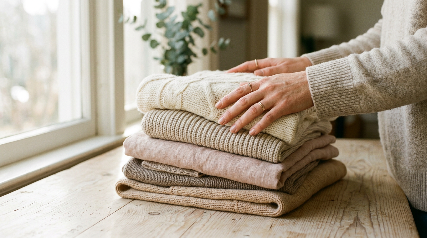
    Ribbed knit gives you rhythm. The vertical lines add structure while the stretch keeps it soft, which makes it a good base layer or a fitted top under something looser.

    Crisp poplin is the opposite: matte, smooth, and it holds its shape. A sharp collar or a sleeve that stands slightly away from the body gives knit something to push against.

    Brushed wool is the soft-focus one. The fuzzy surface absorbs light and blurs edges, so a coat, scarf, or trouser in it adds warmth even in the palest shade.

    Leather is the only finish here with real sheen. Even a little, like a belt, a boot, or the strap of a bag, gives the outfit a point of reflection. Soft, matte leather keeps it quiet. A slicker finish makes it a statement.

    Matte, soft, fuzzy, glossy. Each one answers light differently, and that contrast does the work color usually does.

    Tonal layering rules

    Texture needs a little discipline or it turns into a pile. These are the rules worth keeping:

    1. Stay in one temperature. Warm neutrals (cream, oat, camel) go with warm. Cool neutrals (stone, greige, soft gray) go with cool. Mixed undertones read as an accident, not a choice.
    2. Shift the value a step or two. Aim for light, mid, and slightly deeper within the same family. Three near-identical shades blur together.
    3. Give every layer a different finish. Two matching surfaces side by side flatten each other. If the top is ribbed, make what goes over it smooth.
    4. Pair fitted with volume. Texture lands best when there’s shape underneath it. Something close to the body, something with room.
    5. Put the softest texture near your face. A brushed wool scarf or a ribbed collar frames you better than a stiff one.
    6. Squint test. Look at the outfit with your eyes half closed. If it collapses into one shape, swap a finish, not a color.

    One accent, no more

    Once the textures are working, you can add one accent. One. The moment there are two, the outfit stops being edited and starts being decorated.

    Dusty pink works because it’s muted enough to behave like a neutral. Think a soft knit, a scarf, or a flat. Keep it warm-leaning so it sits with the cream and camel instead of fighting them.

    Silver is even easier, because it’s a finish, not a color. A chain, a cuff, a buckle, or a ring catches light the way leather does, so it stays inside the palette while still adding a little shine.

    Either way, keep the accent small, and put it where the eye already travels: near the face, at the wrist, or at the hem. If the accent is the biggest thing in the outfit, it’s no longer an accent.

    A fit check to try

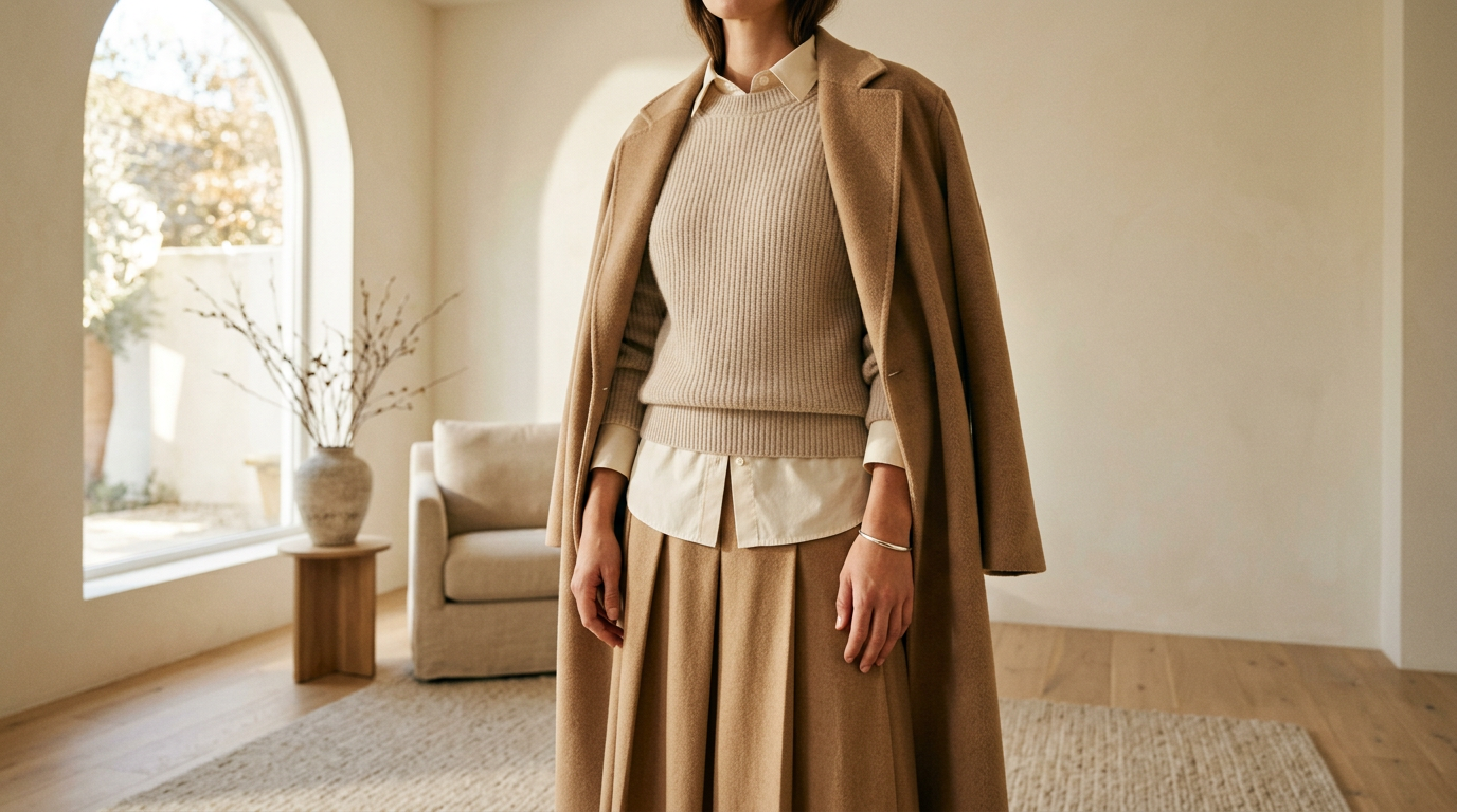
    Start with an oat ribbed knit as the base. Layer an off-white poplin shirt over it, worn open so both surfaces show. Add camel brushed wool trousers, then a leather loafer in a deeper brown. Finish with a single silver cuff.

    It’s one warm family with four finishes, a few steps of value, and one shiny detail. Nothing in it is loud, and it’s still the outfit people ask about.

    The point

    Neutral isn’t the quiet option. It’s the edited one, where every piece has to earn its spot because there’s no color to hide behind. Start with the surfaces, keep the temperature consistent, and let one small thing break the rule. The edit is everything.
  • Cost Per Wear, Explained for People Who Actually Shop

    Cost Per Wear, Explained for People Who Actually Shop

    Cost per wear usually shows up as a permission slip. “It’s $400, but it’s basically $4 a wear.” Said at checkout, before the first wear, by someone who really wants the coat.

    The math is fine. The way it gets used is the problem. Here’s how to use it as a decision tool, one that sometimes tells you no.

    The formula

    Price divided by the number of times you’ll actually wear it. That’s it.

    One upgrade: add what it costs to keep the piece going. Dry cleaning, tailoring, a cobbler visit. If a blazer needs cleaning after every few wears, that belongs in the price.

    The formula is only as good as the number you put in. Everything below is about getting that number right.

    Be honest about the wears

    The wear count is where most people cheat. They count the wears from the fantasy week, the one with the dinner, the trip, and the gallery opening. Your real week has a commute, a desk, and a laundry day.

    Run the piece through a few questions before you pick a number:

    • Can you name three outfits you’d build with things you already own?
    • Does it suit the week you actually have, not the one you post about?
    • Is it still comfortable at hour six?
    • Will you still want it once the trend has moved on?
    • Will it survive your bag strap, your washer, and your weather?

    If you stalled on the first question, your number is lower than you think. When you’re torn between two counts, use the smaller one.

    Ask what it replaces

    A piece that replaces something you’d buy anyway is a different decision from a piece that replaces nothing.

    If you’re going to need a winter coat regardless, compare the two coats against each other. If the piece is a pure add, a fourth black boot or a fifth going-out top, it has to earn its wears from scratch, because it will split them with everything it’s sitting next to.

    Duplicates are where cost per wear quietly falls apart. Two near-identical pieces don’t each get 40 wears. They share 40.

    A worked example

    Example only. These are made-up round numbers to show the math, not real prices or real products.

    Coat A: $400. You’d honestly wear it about 50 times over its life. $400 ÷ 50 = $8 per wear.

    Coat B: $120. You like it, but the fabric will pill and you’ll stop reaching for it after about 12 wears. $120 ÷ 12 = $10 per wear.

    The pricier coat wins, but only by a little. The gap comes from the wear counts, not the price tags. If Coat A would only get 25 wears, it lands at $16 and loses.

    Add the “replaces” question. If Coat B means buying another coat in a year or two, the real comparison gets even less friendly to the cheaper one. If you’d keep wearing Coat B for years, it gets friendlier.

    When the pricier piece loses

    Same disclaimer: still invented numbers.

    Sandal A: $300, sculptural, very fit-check. You’d wear them maybe 10 times, because you can’t walk far in them. $300 ÷ 10 = $30 per wear.

    Sandal B: $90, simple, comfortable, goes with nearly everything. About 45 wears. $90 ÷ 45 = $2 per wear.

    That’s not close. The expensive pair isn’t a bad purchase because it’s expensive. It’s a bad purchase because the wear count is small. Sometimes the right call is to love Sandal A on someone else and buy B.

    The same thing happens with very trend-specific pieces, anything that needs a particular outfit to work, and anything that’s uncomfortable. Price isn’t the variable that matters. Wears are.

    Where cost per wear stops helping

    It can’t tell you if you can afford the piece today. A low per-wear number doesn’t change the total on your card. It also can’t tell you whether you love something, and a piece you love but wear 8 times can still be a good buy if you know that going in.

    So “worth it” shouldn’t be a justification you build after wanting something. Run the numbers first, with the honest count. If the piece still holds up, great. If it doesn’t, you saved yourself a lowkey regret.

    A habit that helps: put the piece on a list, write down your three outfits, and come back in a week. If you can still name the outfits and you still want it, the count is probably real.

    That’s the edit. Fewer pieces, each with a reason.

  • Why We Edit: What Mademoiselle Says No To

    Why We Edit: What Mademoiselle Says No To

    Anyone can add. Adding is easy: more pieces, more colors, more drops, more noise. The hard part is the no.

    That’s the idea behind everything we do. The edit is everything, and an edit only means something if it leaves things out.

    The no is the point

    Open any big retail site and you’ll scroll for twenty minutes and save nothing. It’s not that nothing was cute. It’s that nothing was decided. Somebody put it all on the page and left the sorting to you.

    We’d rather do the sorting. So a lot of things don’t make it onto Mademoiselle, including plenty of perfectly nice ones. Nice isn’t the bar.

    Here’s what usually gets a no:

    • The piece that looks great in one photo and falls apart in real life.
    • The trend that’s already everywhere by the time it ships.
    • The fabric that feels like a compromise the second you touch it.
    • The “good enough” fit that needs a stylist, a belt, and a prayer.
    • The thing you’d only buy because it was there.

    None of this is about being precious. It’s about respect for your closet, your budget, and your taste.

    Three questions, no exceptions

    Every piece has to answer the same three questions. If it can’t, it’s out. No special cases for a pretty color or a good story.

    Question one: is the fabric better?

    Start with the hand-feel. Texture is where a piece tells you the truth. Does it drape or cling? Does it feel considered against your skin, or like it was made to survive a photoshoot and nothing else?

    We care about how a fabric looks on the hanger, but we care more about how it behaves at hour nine of a long day. A good knit holds its shape. A good woven moves when you do. You can tell, and so can everyone standing next to you.

    This is also why we talk about fabric the way we do. Not as a spec sheet, but as the reason you’ll reach for something again.

    Question two: is the fit better?

    A great fit isn’t about being tiny or being tailored to within an inch of its life. It’s about a piece looking like it was meant for you without any adjusting, tugging, or mid-fit-check negotiation in the mirror.

    The test is simple. Put it on, walk away from the mirror, and forget about it. If you’re still thinking about the waistband an hour later, it failed.

    Proportion matters here too. We look for shapes that sit well with the rest of what you already own, because a piece that only works with one other piece isn’t an edit. It’s a dependency.

    Question three: is the mood better?

    This one’s the least measurable and the most important. Mood is what happens when fabric and fit add up to something you can feel. It’s the lewk you’d post without overthinking. It’s the GRWM where you stop halfway through because you’re already done.

    It’s also the question that keeps us honest about trends. Plenty of things are technically well-made and still have no point of view. A piece should make an outfit more interesting, not just more finished.

    If it doesn’t change the vibe, it doesn’t belong.

    Why fewer is a feature

    A small edit isn’t a limitation we’re working around. It’s the product.

    When there are fewer pieces, each one has to carry weight. You spend less time scrolling and more time wearing. Your closet starts to feel like a set of decisions instead of an accumulation of impulses. The things you own start talking to each other.

    It’s also a quieter way to build taste. Instead of chasing every moment, you notice what’s early, keep what’s good, and move on before it’s saturated. Your inspo folder gets smaller and sharper, and so does your rotation.

    Lowkey, it’s also better for your credit card. When everything on the page has earned its place, you don’t need to be talked into anything.

    What this means for you

    We’re not here to tell you what to wear. We’re here to make sure that when you decide, it’s worth it. Better fabric. Better fit. Better mood.

    You don’t need more options. You need better ones, already sorted by someone with a point of view and a very short yes list.

    That’s the edit. And yes, it’s everything.

  • How to Read a Fabric Label Like You Mean It

    How to Read a Fabric Label Like You Mean It

    Everyone checks the brand name. Almost no one reads the tag sewn into the side seam, and that’s the one that tells you whether you’ll still be wearing the piece in two years.

    Fiber content is not the whole story, but it’s a solid first read. Here’s how to decode it, fiber by fiber, so your next fit check starts before you even try something on.

    Start with the order

    Fibers are listed from most to least. A tag that reads 80% cotton, 20% polyester is mostly a cotton story. One that reads 15% wool, 85% acrylic is mostly an acrylic story with a wool cameo. Read the first line, then look at what’s supporting it.

    Also check the care instructions. “Dry clean only” on a piece you plan to wear weekly is a lifestyle decision. Make it on purpose.

    Wool: warm, bouncy, forgiving

    Wool fibers have natural crimp, which traps air. That’s why wool is warm without being heavy, and why it bounces back from wrinkles instead of holding onto them. It drapes with some body, so it looks structured without being stiff.

    The catch is texture. Finer wools like merino feel soft against skin. Coarser wools can itch, especially at the neck and wrists. Wool also pills, mostly in high-friction zones like underarms and where a bag strap sits. That’s normal and fixable with a fabric shaver. A good wool piece pills lightly at first, then settles down.

    Cotton: easy, breathable, depends on the weave

    Cotton is the everyday fiber. It breathes, it’s comfortable, and it washes well. How it behaves depends on the yarn and the weave. Tightly woven poplin holds a crisp line. A loose jersey slouches. Longer fibers, often labeled things like Pima or Supima, make smoother, stronger yarn that resists pilling better than short-fiber cotton.

    Cotton wrinkles, though less dramatically than linen. It can also shrink and fade over time. Pre-washed or garment-dyed cotton has already done some of that for you.

    Linen: the wrinkle is the point

    Linen is cool, dry, and a little crisp. It gets softer every time you wash it, and it wrinkles almost on contact. If you want a pressed look, linen will fight you. If you like a lived-in, slightly undone vibe, it’s perfect.

    Pure linen can feel stiff when new, and a loose weave can be see-through in light colors. A linen-cotton blend is a good middle ground: you keep the airy hand with fewer creases and a softer start.

    Viscose: beautiful drape, needs a little respect

    Viscose, which US labels often list as rayon, is made from plant cellulose. It’s the reason a slip skirt moves like liquid. It’s smooth, lightweight, and comfortable in heat.

    It’s also weaker when wet. Aggressive washing can stretch it, warp it, or shrink it. It wrinkles easily too, and it can lose shape at the elbows and seat if it’s cut too fine. Modal and lyocell are relatives with similar softness and, generally, better wash behavior. For viscose, follow the care tag exactly.

    Blends: read the job each fiber is doing

    Blends aren’t automatically a downgrade. They’re fibers with assigned roles.

    • Elastane or spandex (a small amount): adds stretch and recovery, so knees and seats don’t bag out.
    • Nylon: adds strength, especially in knits that get a lot of wear.
    • Polyester: adds wrinkle resistance and shape retention, but it doesn’t breathe like natural fibers, and it can pill and hold odor.
    • Wool with synthetics: can add durability, but if wool is a minor share, you won’t get wool’s warmth or feel.

    The question to ask: what is each fiber doing here? If you can answer that, the blend is working for you. If one is just there to lower the cost, you’ll feel it by the third wear.

    What to check in hand

    The tag gets you halfway. Texture finishes the job. When a piece arrives, or when you’re touching it anywhere, run through this before you cut tags:

    • Crumple it. Squeeze a corner in your fist for five seconds, then let go. Does it spring back, soften, or stay creased?
    • Hold it to the light. You’re checking density. If it’s see-through in a color you planned to wear without layers, you’ll know now.
    • Rub it against itself. Fabric on fabric previews pilling. If it fuzzes in a few passes, it will on your arms too.
    • Drape it over your hand. Does it fall in soft folds, or stand off like cardboard? That’s the silhouette you’re buying.
    • Pull gently at a seam. Gaps or stressed threads mean it won’t make it through a season of real life.
    • Check the inside. Clean seams and finished edges tell you how much care went into the rest.

    Texture over label

    A famous name sewn into the collar means nothing if the fabric underneath pills, sags, or itches. A piece with no recognizable name and a dense, well-finished fabric will look better on the fortieth wear than the hyped one on the fourth.

    That’s the whole idea behind how we edit: better fabric, better fit, better mood. Reading the tag is the quickest way to start doing it yourself.

    So next time something catches your eye, flip it over before you fall for it. The tag won’t tell you everything, but it will tell you where to look.

  • The Fit Check Checklist: Six Things to Look at Before You Leave the House

    The Fit Check Checklist: Six Things to Look at Before You Leave the House

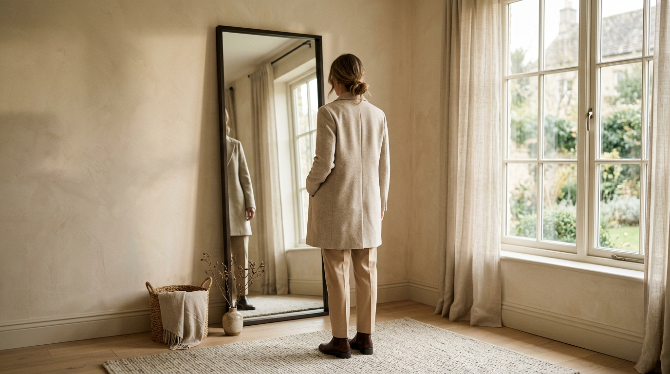
    The GRWM is done. The outfit is on, the playlist is going, and you’re already a little late. This is the moment most people glance at their face, grab their keys, and go.

    Don’t. Give the mirror ninety more seconds. A proper fit check isn’t about fixing a bad outfit. It’s about catching the small stuff that turns a good outfit into one that looks intentional.

    Here’s the routine, in order.

    1. Start at the shoulders

    Look at where the shoulder seam lands. On a jacket, shirt, or knit with a set-in sleeve, it should sit right at the edge of your shoulder, where the arm begins.

    If it creeps toward your elbow, the piece reads as oversized. That’s great when you chose it and sloppy when you didn’t. The tell is whether the rest of the outfit agrees: a drop shoulder with a clean, narrow bottom half looks planned. A drop shoulder you didn’t mean to have just looks borrowed.

    If the seam sits up on top of your shoulder and pulls, the piece is too small through the frame. No styling trick fixes that.

    2. Check the hem

    Hems are where outfits quietly fall apart. Look at every one you have: trousers, skirt, dress, jacket, even the shirt under your sweater.

    For trousers, decide what the hem is doing. Cropped should clearly show the ankle, not hover awkwardly an inch above it. Full length should skim the top of your shoe, not drag under your heel. For skirts and dresses, check the length sitting down too, since that’s where most of your day happens.

    And look at the layers. A shirt hem peeking out from under a sweater is a lewk when it’s a few even inches. It’s a mistake when it’s lopsided.

    3. Walk, sit, reach

    Standing still in front of a mirror is the easiest test an outfit will ever take. So give it a harder one.

    Walk across the room and watch how the fabric moves. Good fabric swings and settles. Bad fabric clings, bunches, or rides up. Sit down and see what your waistband, hem, and neckline do. Lift your arms like you’re reaching for something on a high shelf and check whether the whole top comes with them.

    Also check the light. Step near a window and see if anything is more see-through than it looked under your bedroom lamp.

    4. Turn around

    You spend the whole day facing forward, but everyone else gets the back view. Use a second mirror or your phone camera and look at what’s behind you.

    You’re checking for pulling across the shoulder blades, a waistband that gapes, a bra line you didn’t plan on showing, a tag or loose thread, and pockets that sit too low or too wide. If the outfit only works from the front, it only half works.

    5. Look down at your shoes

    Proportion is the whole game here. Wide-leg trousers want a shoe with some presence, or the hem swallows your foot. A slim trouser can take something sleeker. A chunky sole under a delicate, floaty skirt can feel like two different outfits arguing.

    Step back far enough to see your whole body and ask whether your shoes look like they belong to the rest of the fit. Then check your socks, if they’re showing. They count.

    6. Take one thing off

    This is the step that makes the edit an edit. Before you walk out, find the loudest thing you’re wearing and remove it.

    Maybe it’s the third necklace, the extra belt, or the scarf you added at the last second because the outfit felt unfinished. Usually the outfit was already finished. If you take it off and miss it, put it back. But most of the time you won’t.

    How to take a fit check photo that tells the truth

    A photo shows you what a stranger sees, which is why it catches things the mirror forgives. It’s also very easy to make a photo lie, so keep it honest.

    Face a window for soft, even light. Overhead bulbs and a lamp behind you flatten fabric and hide texture. Put the phone at about hip to chest height, not above your head, and step back far enough that your shoes are in the frame. Cropping at the knee hides the exact proportion you’re trying to check.

    Skip portrait mode, beauty filters, and anything that stretches or smooths. Wipe the mirror if you’re using one. Then take three shots: front, back, and one mid-stride. The mid-stride shot is the most useful, because it shows how the outfit behaves when you’re actually moving.

    Look at the photo before you post it, or before you decide. If something bugs you in the picture, it will bug you at dinner.

    The screenshot version

    • Shoulders: does the seam land where you meant it to?
    • Hems: are trousers, skirt, and layers all clearly one length or the other?
    • Movement: walk, sit, reach. Does the fabric cooperate?
    • Back view: any pulling, gaping, or stray tags?
    • Shoes: do they match the weight of the hem?
    • Remove one thing: take off the loudest piece, then decide.

    That’s the whole routine. Once it’s habit, it takes less time than finding your keys. The edit is everything, and it starts at the mirror.